
CREATIVE
direction
Rockport reached out with a clear goal: evolve their visual identity without losing the heritage and quality they’re known for. The challenge was to modernize the aesthetic and speak to a new generation while honoring the craftsmanship that built the brand. Our job was to create visuals that moved beyond traditional footwear campaigns. We wanted to lean into character, texture, and real-world settings. No glossy studio setups. No posed fashion moments. This had to feel worn in, lived in, and ready to move.
The creative direction focused on practical style and everyday resilience. The pieces needed to connect with people who want products that look sharp and perform without compromise. We aimed to reintroduce Rockport as a brand rooted in authenticity, versatility, and quiet confidence. This was all about showing timeless quality in motion.
VISUAL
direction
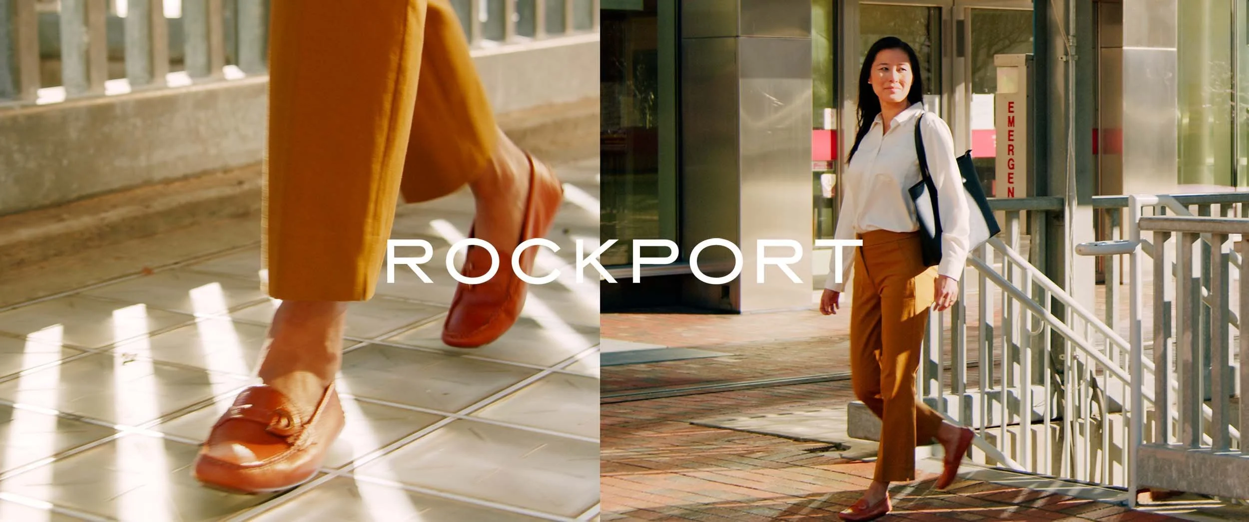
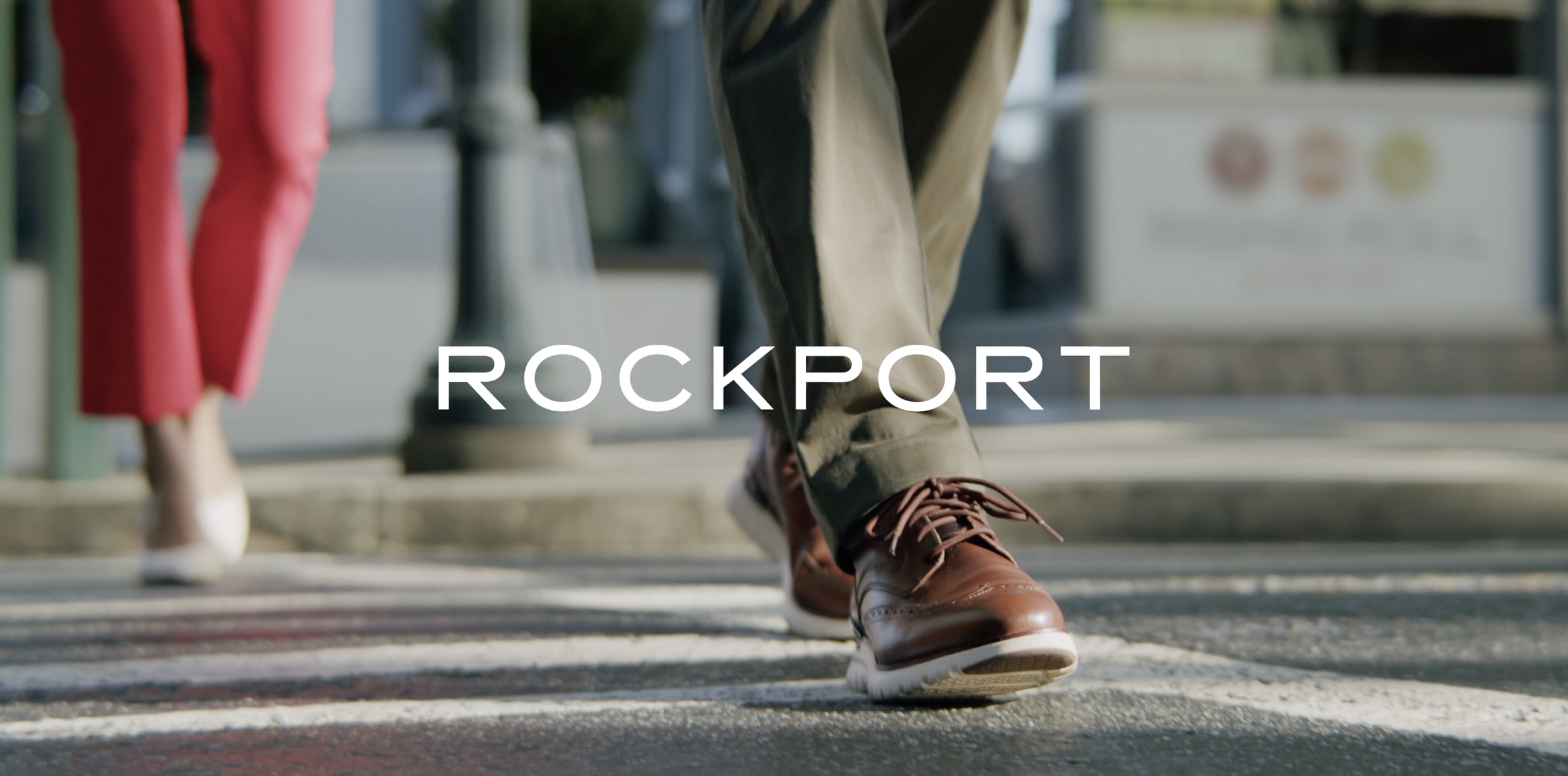
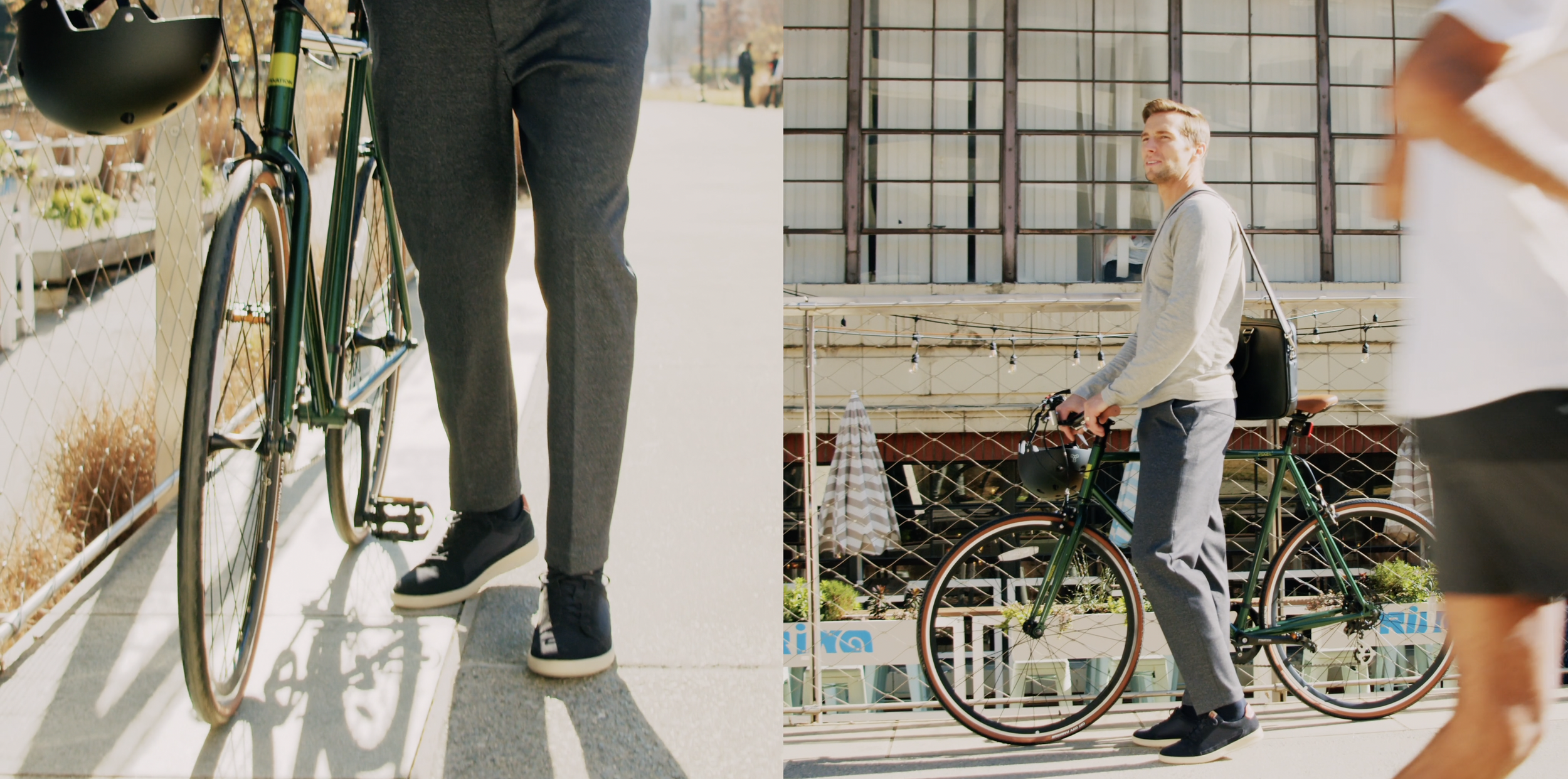
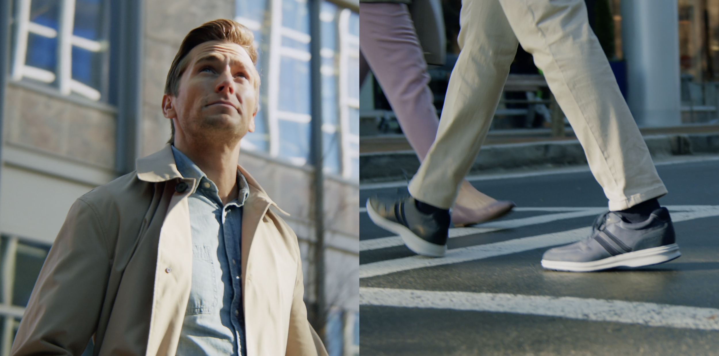
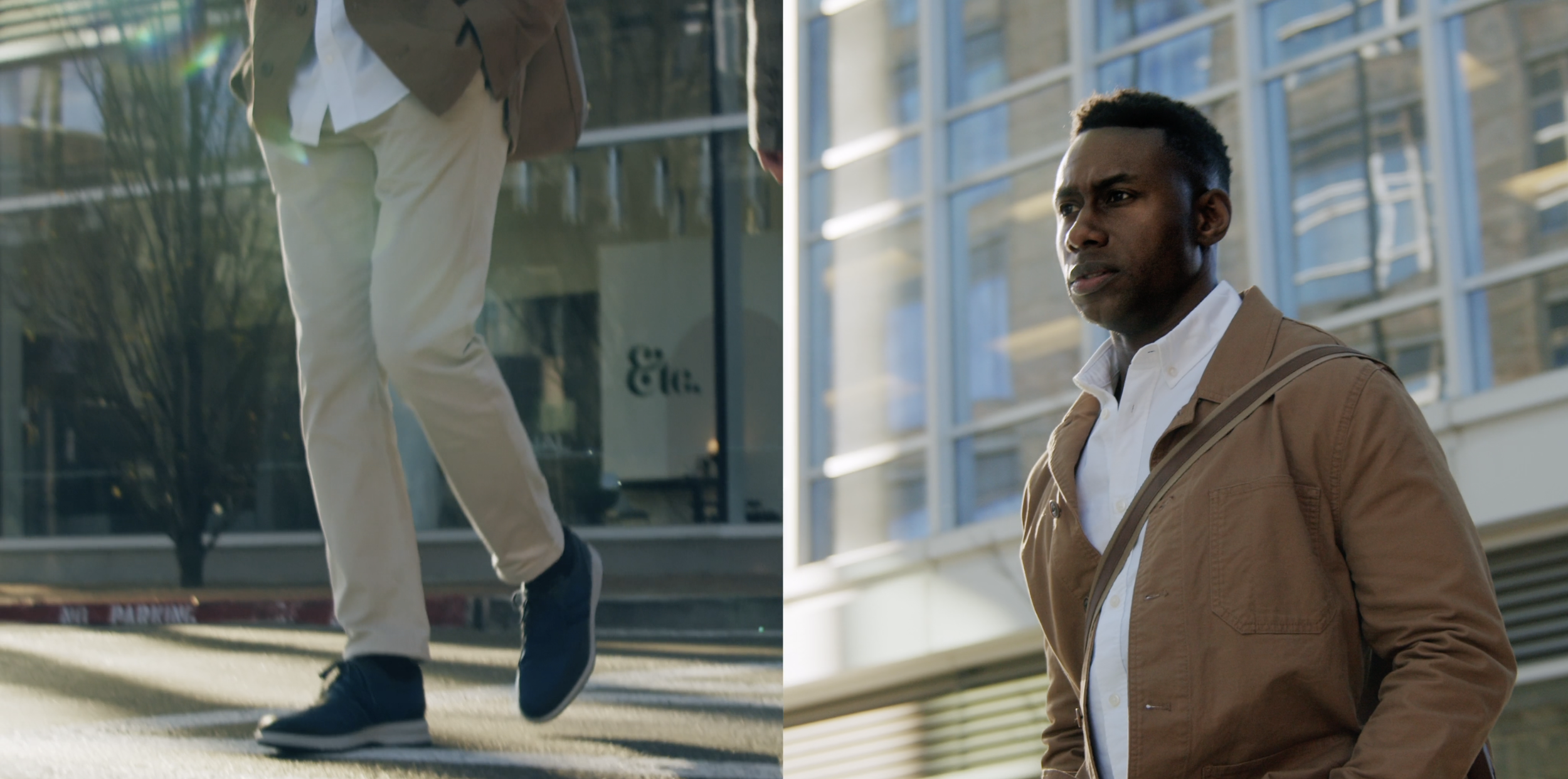
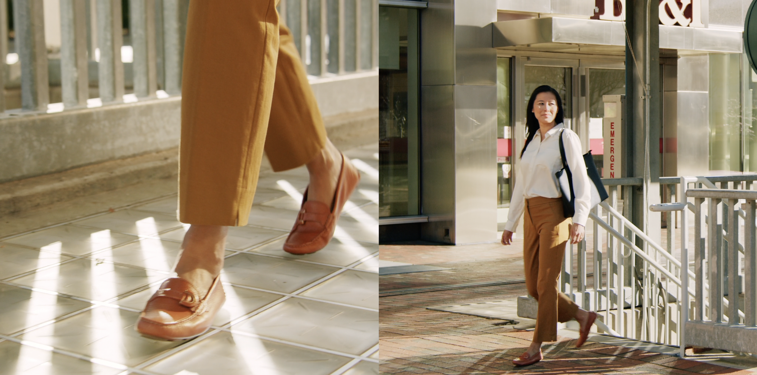
The shoot focused on movement, environment, and honest textures. We shot handheld on location to give the footage an immediate, grounded feel. Natural light guided the tone. Nothing was overlit or polished. Instead, we leaned into the imperfections of real spaces like cracked pavement, shifting shadows, and the grain of weathered architecture.
We selected locations where reflections from nearby skyscrapers would bounce light onto the models. This created a checkerboard lighting pattern that added texture to both the subject and background, creating a sense of visual depth. The lighting setup helped the models stand out while still feeling part of the urban landscape.
The color grade stayed restrained and natural, emphasizing neutral tones like browns, charcoals, and off-whites to support the utility-forward tone of the campaign. The shoes were shown in motion to demonstrate comfort and capability. Macro shots were used to highlight detail without interrupting the momentum of the story.
To heighten the energy of the edit, we used rhythmic music and sharp sound design elements. Each cut was timed to maintain a deliberate pace, helping the visuals feel more alive and connected. Footsteps, ambient city sounds, and low-frequency hits were layered to add weight and realism without distraction.

IMPACT
This campaign marked a tonal shift for Rockport. It gave the brand a fresher look without abandoning its core values. The content was repurposed across retail banners, social media, and digital campaigns, providing flexibility while maintaining a cohesive identity. The photography and video assets became the backbone of a broader repositioning effort, helping Rockport speak more directly to style-conscious professionals who still prioritize comfort and performance.
The response internally was strong. Marketing teams leaned on this new direction for upcoming product launches and seasonal rollouts. For external audiences, the work helped modernize perception and laid the groundwork for future storytelling rooted in real people, real places, and everyday movement.